How to Customise Templates for Your Labour Campaign
By Nitesh Patel and Kelsey Lewis
Published:
Facebook
X
WhatsApp
Email
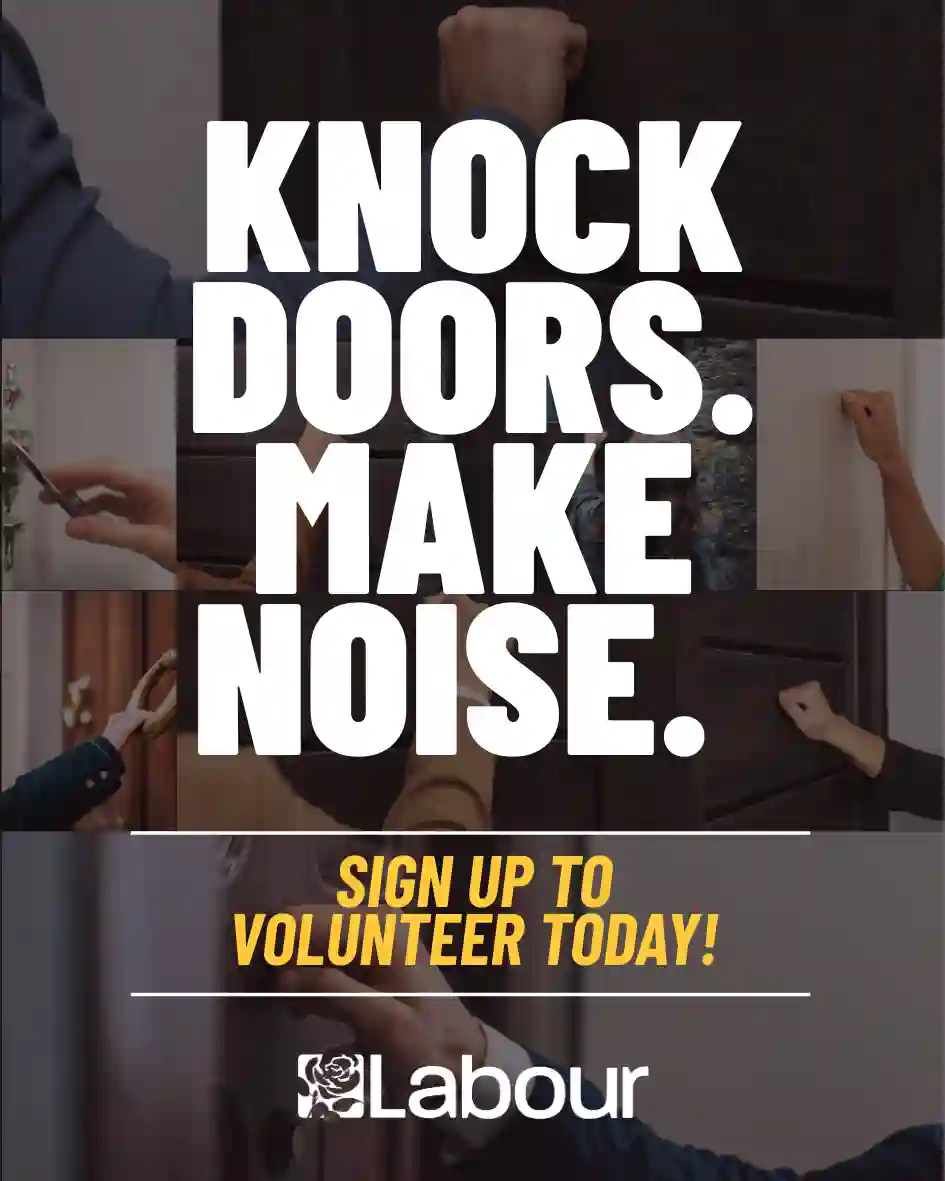
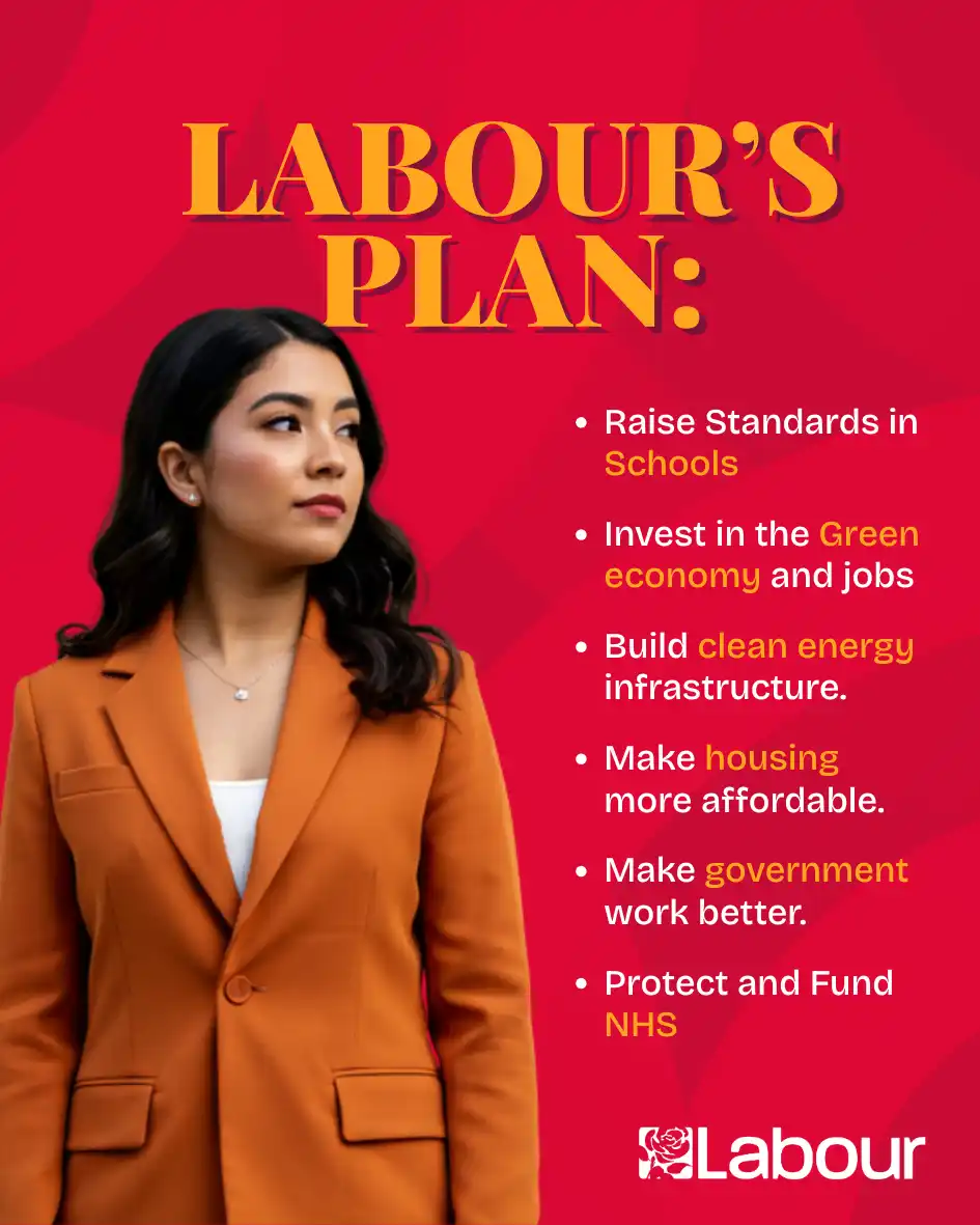
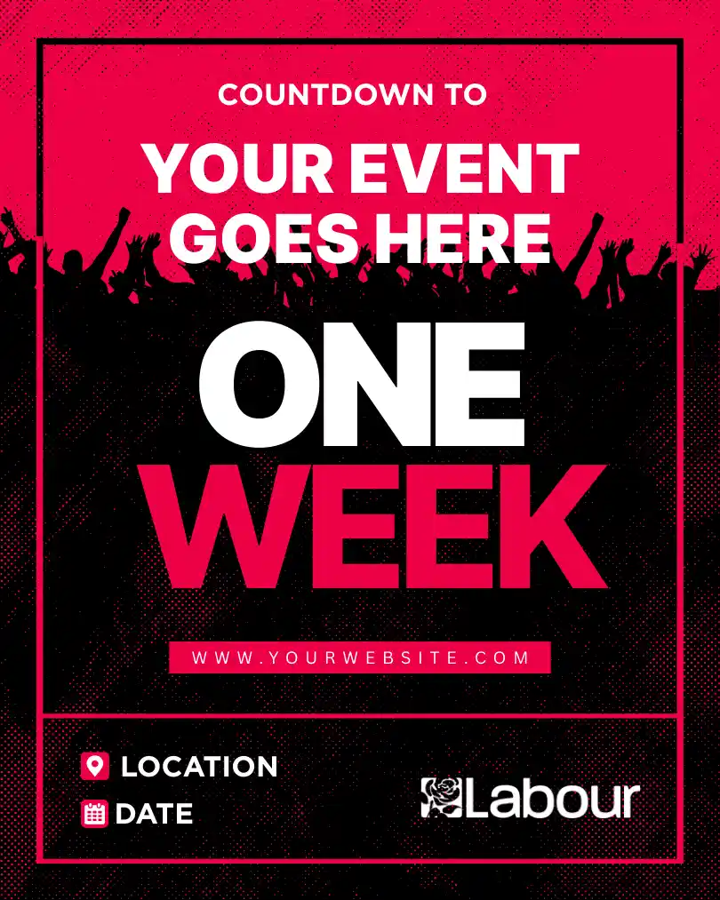
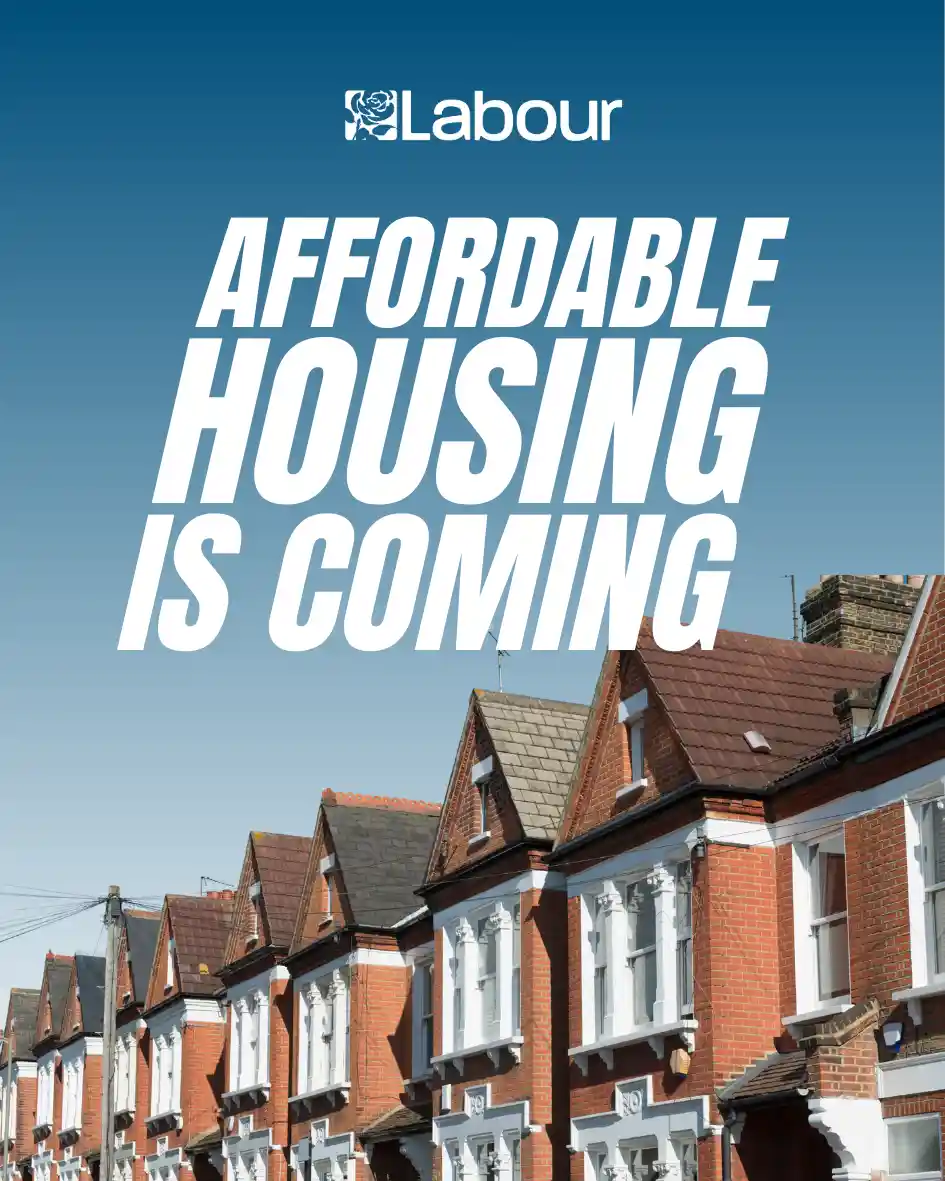
This week we’re here to help you turn templates into graphics that feel unmistakably yours. Templates are not meant to make your campaign look generic or uniform. They are created to save you time and make high-end campaign design more accessible to more people. That is why we do what we do at Labour Templates. We believe in democratising design and making sure every Labour candidate can look professional online. In an increasingly digital campaign space, your online presence is often the first impression voters get. High-quality graphics consistently outperform lo-fi alternatives, and strong design helps establish credibility when people search for you or see your content shared by others.
Good design also helps build your campaign’s visual identity, which comes from consistent cues over weeks and months. When voters see the same colours, fonts, and messaging repeatedly, they begin to associate them with you and your campaign. The goal is simple: each graphic should be instantly recognisable as yours. That consistency is what strengthens brand recognition over time.
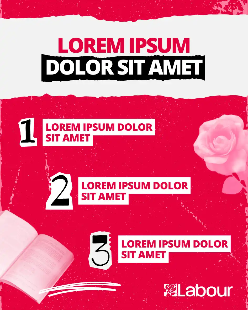
Our templates are built to be flexible. Sometimes that means using them largely as they are, particularly for national messaging or general GOTV posts. But most of the time, their real strength comes from applying your own branding and local content so they clearly belong to your campaign. This article walks through how to do exactly that, showing how a single template can be adapted step by step until it feels like your campaign.
Start with the Right Tools
For campaigns that are serious about their brand and appearance, we highly recommend having a Canva Pro account. All of our templates are designed in Canva because it’s the most user-friendly design software for non-designers. Canva also offers excellent tutorials and resources to help you get comfortable with the platform (here).
Another essential tool is a brand kit. This is your master reference for your campaign’s colours, fonts, logos, and approved images. Having a brand kit in place makes it much faster and easier to apply your identity consistently across all templates and graphics. Templates plus a brand kit are the foundation for quick, high-quality content creation.
How to Apply Your Brand to Graphics
1. Logos and Attribution
The first question every graphic should answer is simple: who is this from?
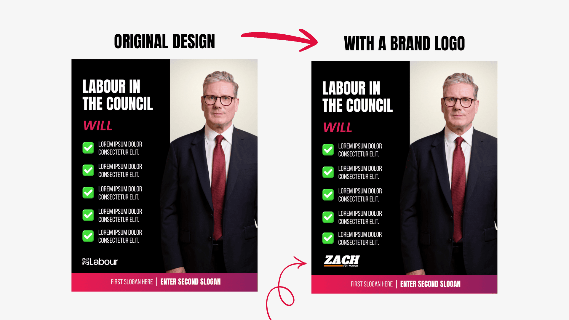
For most campaigns, the easiest and most effective way to answer that question is by adding a logo. Using your logo consistently across social media, print, and digital assets creates repetition, and repetition builds recognition. To work best, the logo should be clearly visible, high-contrast, and positioned consistently across graphics. For most local campaigns, logos remain the fastest way to establish clear ownership, especially on shareable content.
It’s also worth remembering that these graphics may be shared by supporters. Not everyone will see them on your page, so clear attribution helps make sure your campaign is recognised wherever the content appears.
✍️ Pro Tip: If your campaign develops a strong, recognisable visual identity over time, the need to include your logo on every single post can decrease. For most campaigns, however, logos remain the quickest way to establish ownership.
2. Colour
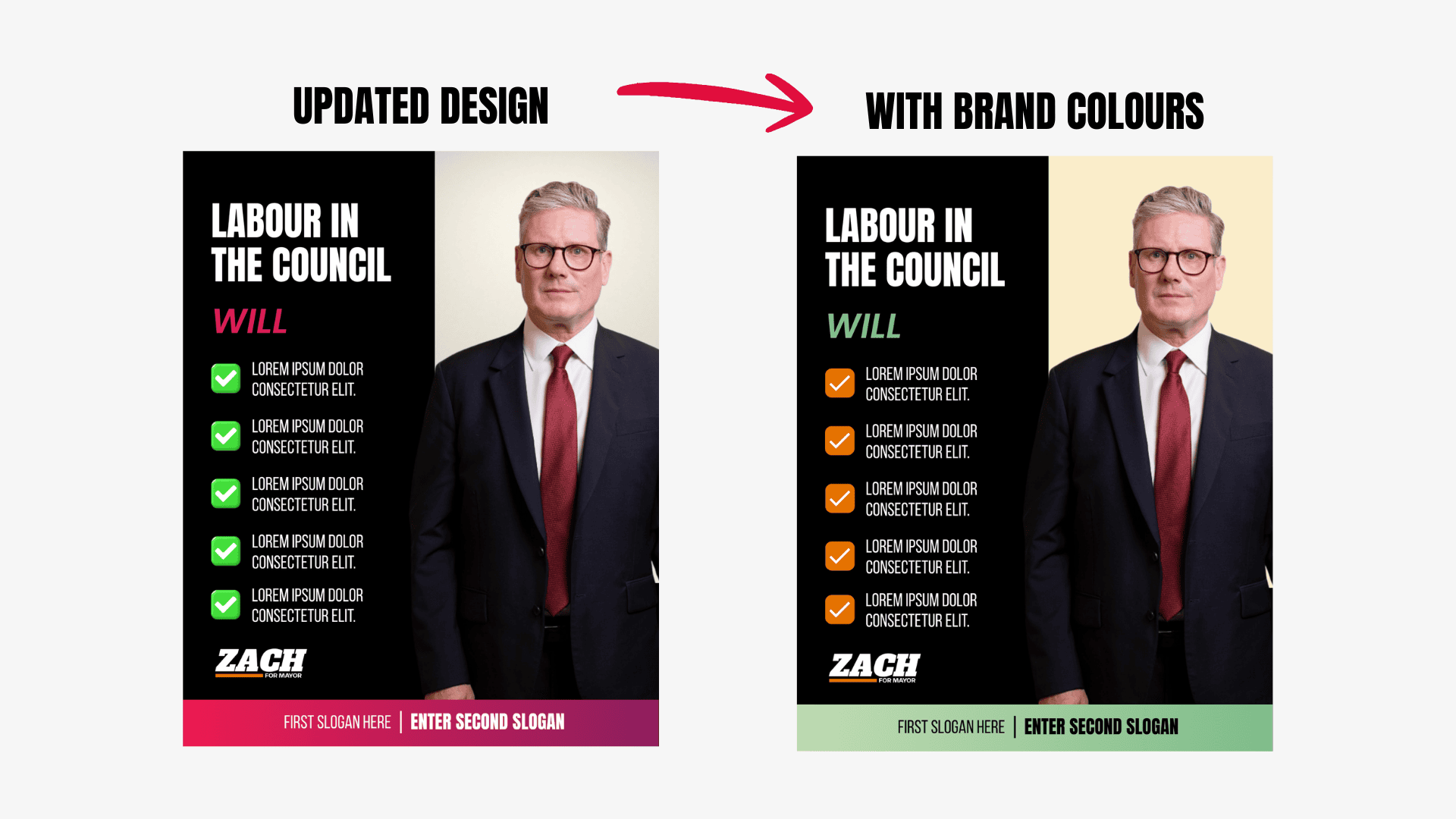
Colour is one of the most powerful tools in your campaign’s visual repertoire. Whether you are following the Labour brand or branching off into your own identity, you should use colour consistently. Consistent colour helps voters quickly recognise your campaign and make your feed feel intentional.
A strong palette typically includes:
A primary colour that represents your core identity.
A couple of supporting colours that complement it.
One or two accent colours that you can use sparingly to highlight important elements like calls to action or key messages.
Neutral colours to help with readability and balance.
Most design systems suggest keeping your palette in the range of three to five colours total. This gives you flexibility without overwhelming your layouts. A helpful way to think about colour is the 60‑30‑10 rule. In this approach, your primary colour should be most visible (60%), your secondary colours provide support (30%), and your accent colours draw the eye to the strongest messages (10%).
Pro Tip: Think of your colour palette as a system, not a constraint. There are times when it makes sense to go slightly off-script if it serves the message. For example, using purple on International Women’s Day or green for an Earth Day post. Variance here and there is fine so long as those choices still feel intentional and connected to your overall identity.
3. Fonts
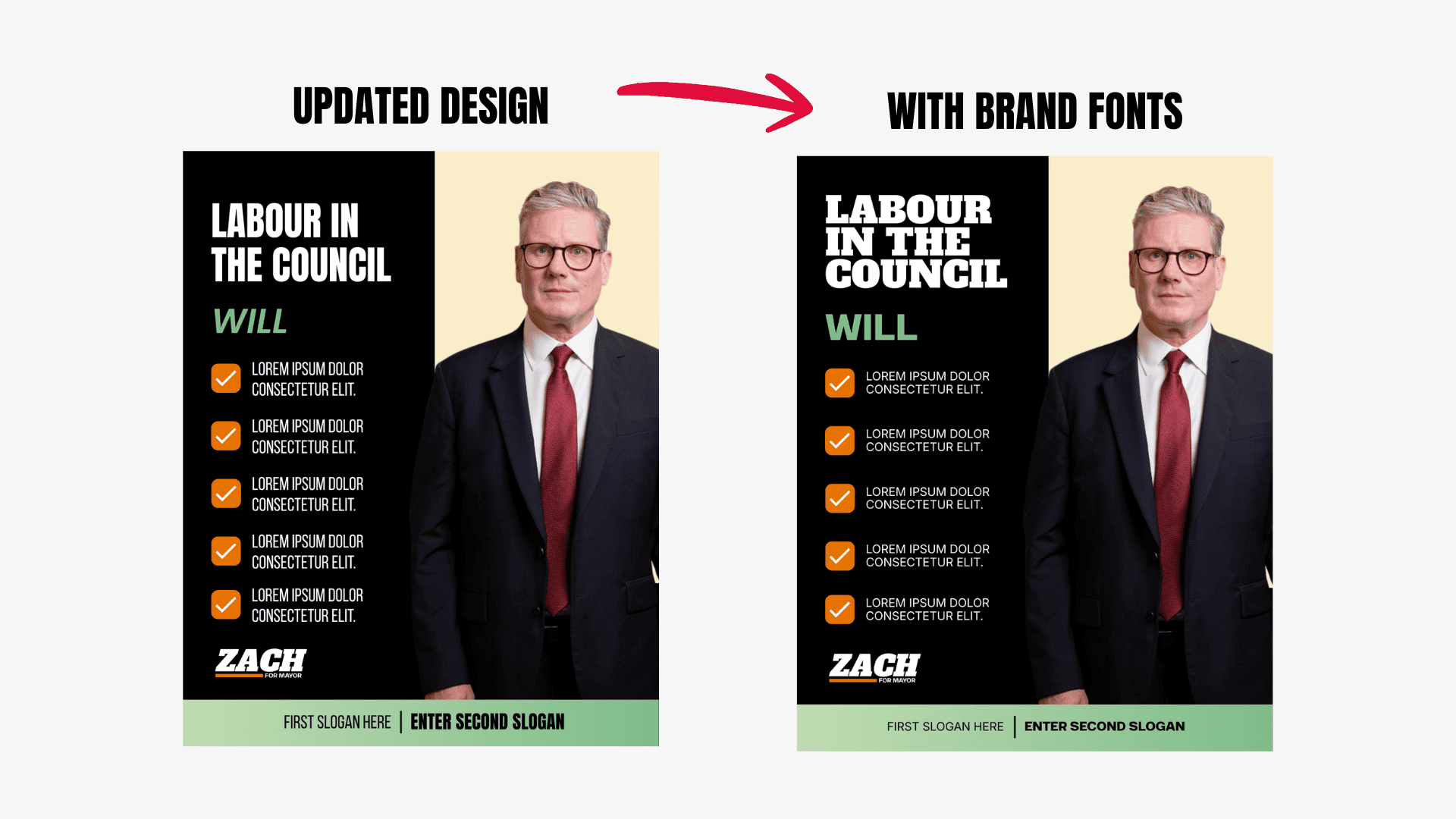
Fonts are a key part of your campaign’s visual identity. They guide the reader’s eye, create hierarchy, and help your graphics feel polished. We recommend three core fonts. For high-end design, these are three unique fonts (not just Times New Roman at three different sizes.):
Heading: for main titles and key messages
Subheading: for secondary text and structure
Body: for paragraphs and longer copy
Occasionally, you can mix things up, for example, using your subheading font as a heading to add variety without introducing a new typeface. You can also include accent fonts sparingly, ideal for quotes, calls-to-action, or playful campaign posts. Use them intentionally and in small doses to add personality without cluttering your design.
✍️ Pro Tip: When pairing fonts, look for contrast in style or weight. For example, a bold, attention-grabbing headline paired with a clean, neutral body font. This helps your text stand out while keeping it readable. Prioritise clarity over personality, especially in body text.
4. Photos
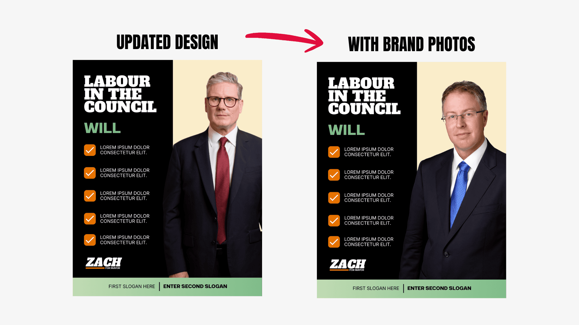
Photos are what can take a graphic from good to great. The quality, style, and composition of the images you use have a huge impact on how professional your graphics feel.
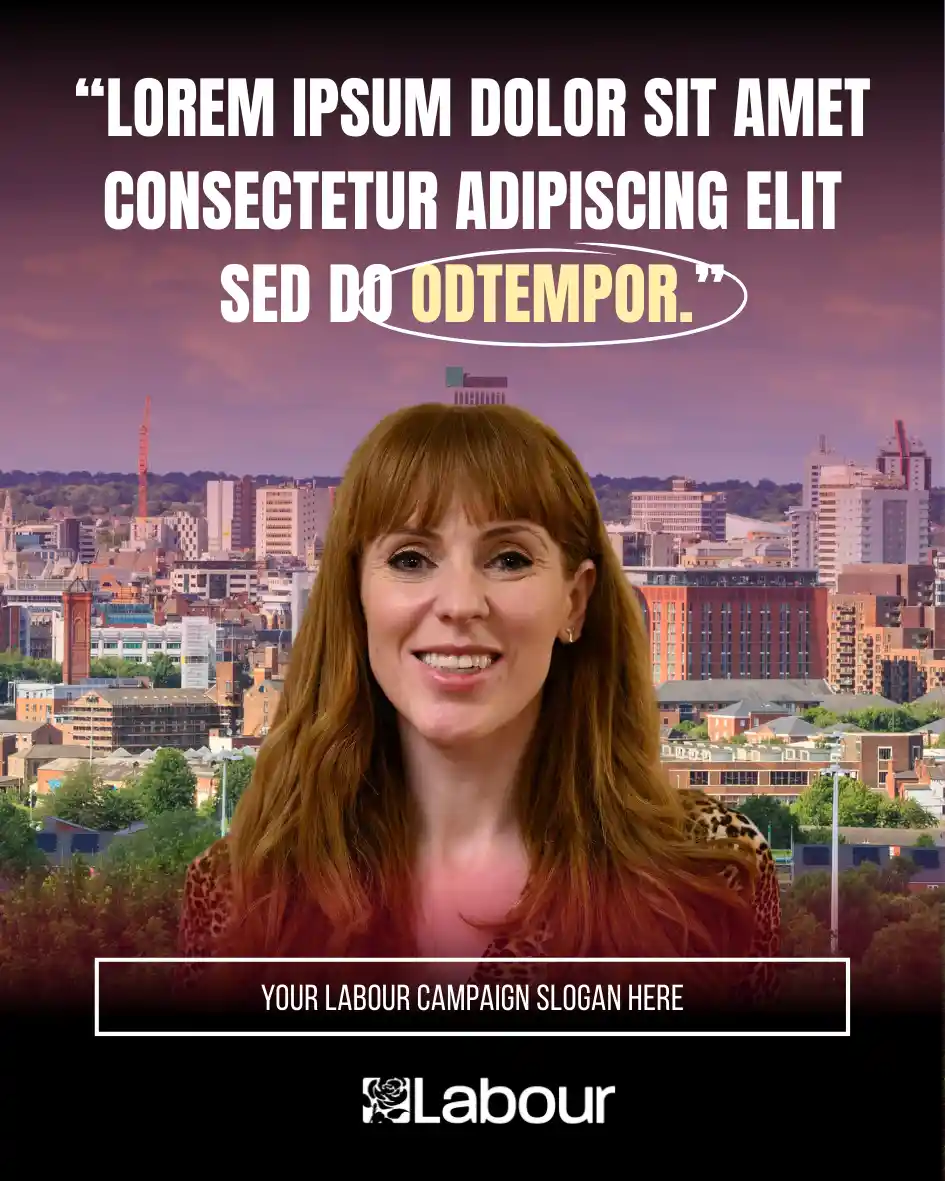
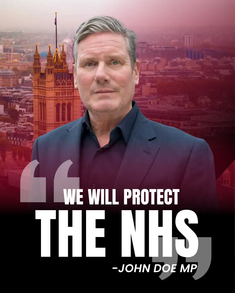
Templates are carefully designed with specific photo types in mind. If a template includes a full-body shot, headshot, or action image, following the example in the template makes your life easier and keeps the layout balanced, polished, and effective.
✍️ Pro Tip: If you can, get professional photos done early in your campaign and upload them to Canva’s brand kit. Having a library of ready-to-use, high-quality images saves time, keeps your graphics consistent, and makes swapping photos into templates effortless.
5. Content
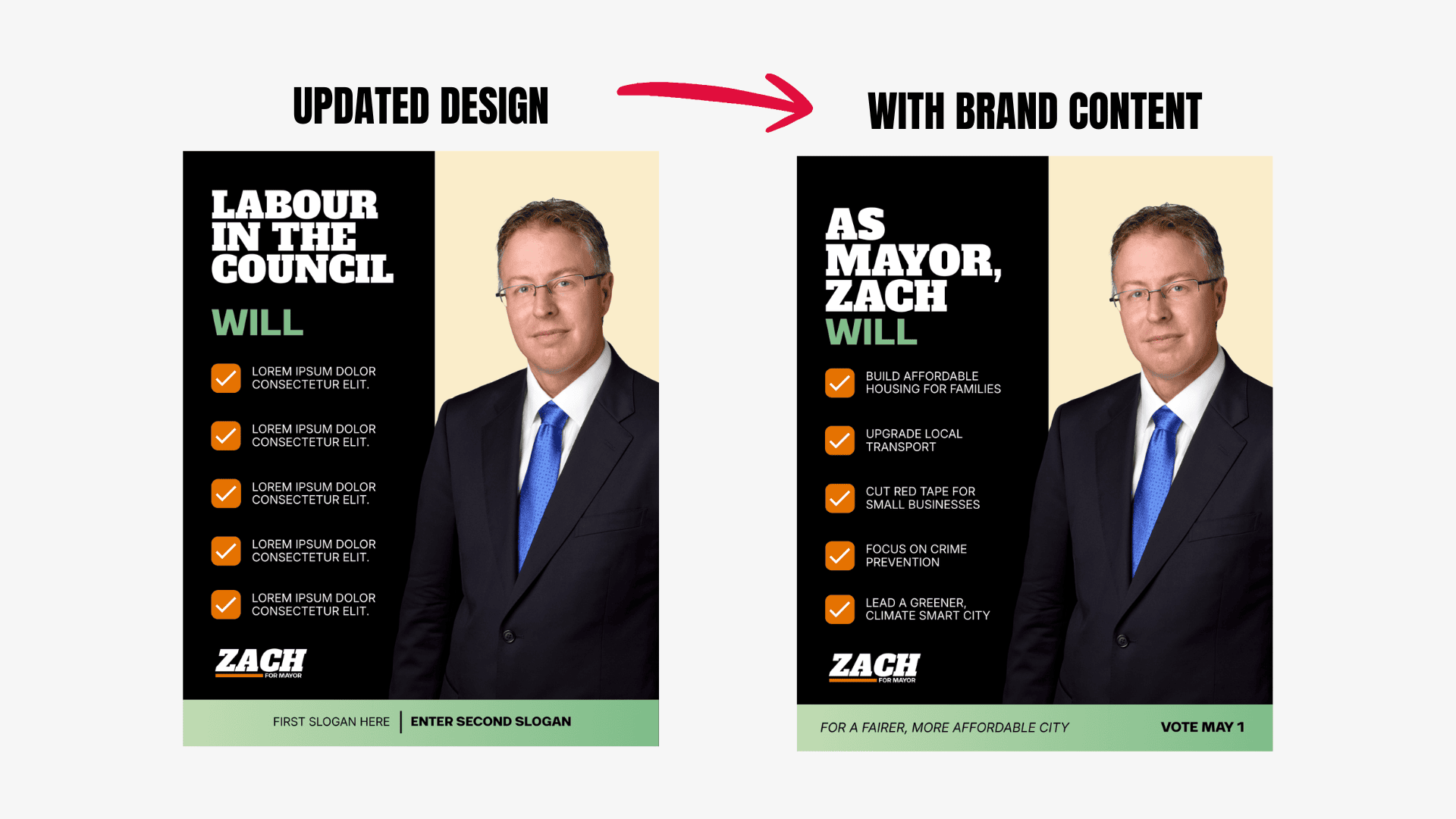
The most important part of any graphic is the content itself, the message you’re sharing with voters. Templates give you a polished design, but the text, issues, and calls to action should come from your campaign. This is where you make the template truly yours.
Start with your local issues, policies, and priorities. Highlight what matters to your constituency or ward, and include any personal updates, events, or campaign milestones. Even small adjustments, swapping in local examples and places, make a graphic feel relevant and timely.
Keep your text clear and concise. People scroll quickly, so your headline should communicate the main message in a few words, with any supporting details easy to read at a glance. Calls to action, like “Join us at the community meeting” or “Get out and vote,” should be prominent and unambiguous.
✍️ Pro Tip: Avoid writing all your copy in advance and forcing it into the template later. Templates assume a certain length and hierarchy of text, so it’s best to draft your content in the design itself, or review it closely against the layout. In practice, you might also need to move text blocks slightly to fit your message. Above, you can see we had to split the footer text blocks to keep the graphic balanced and readable.
Final Results
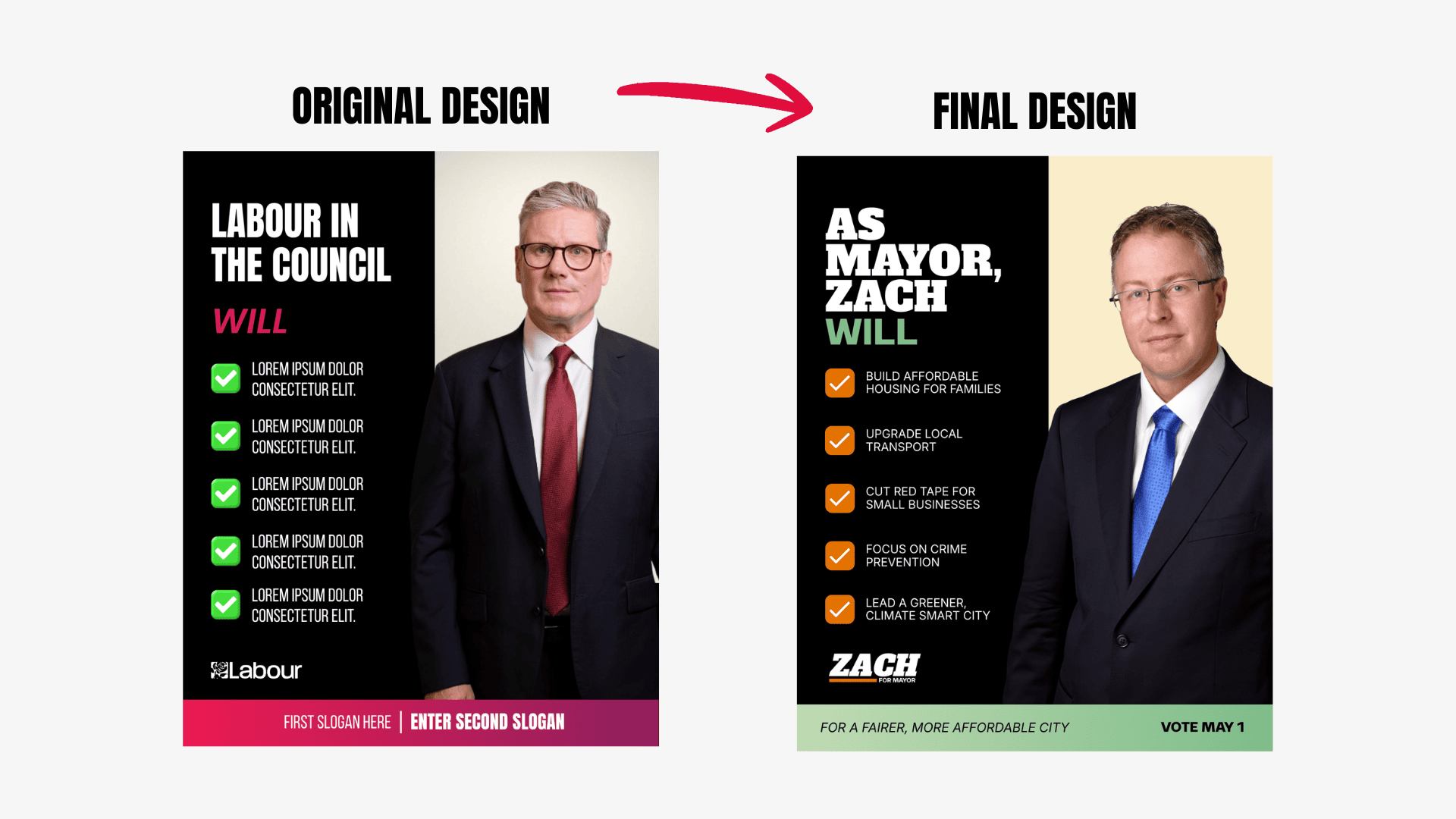
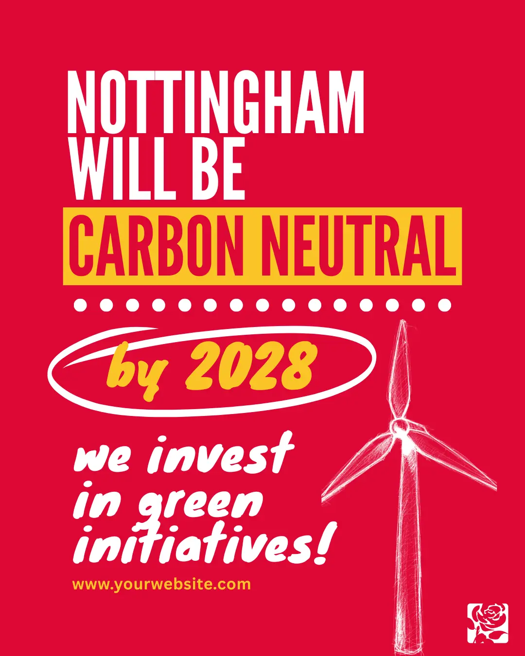
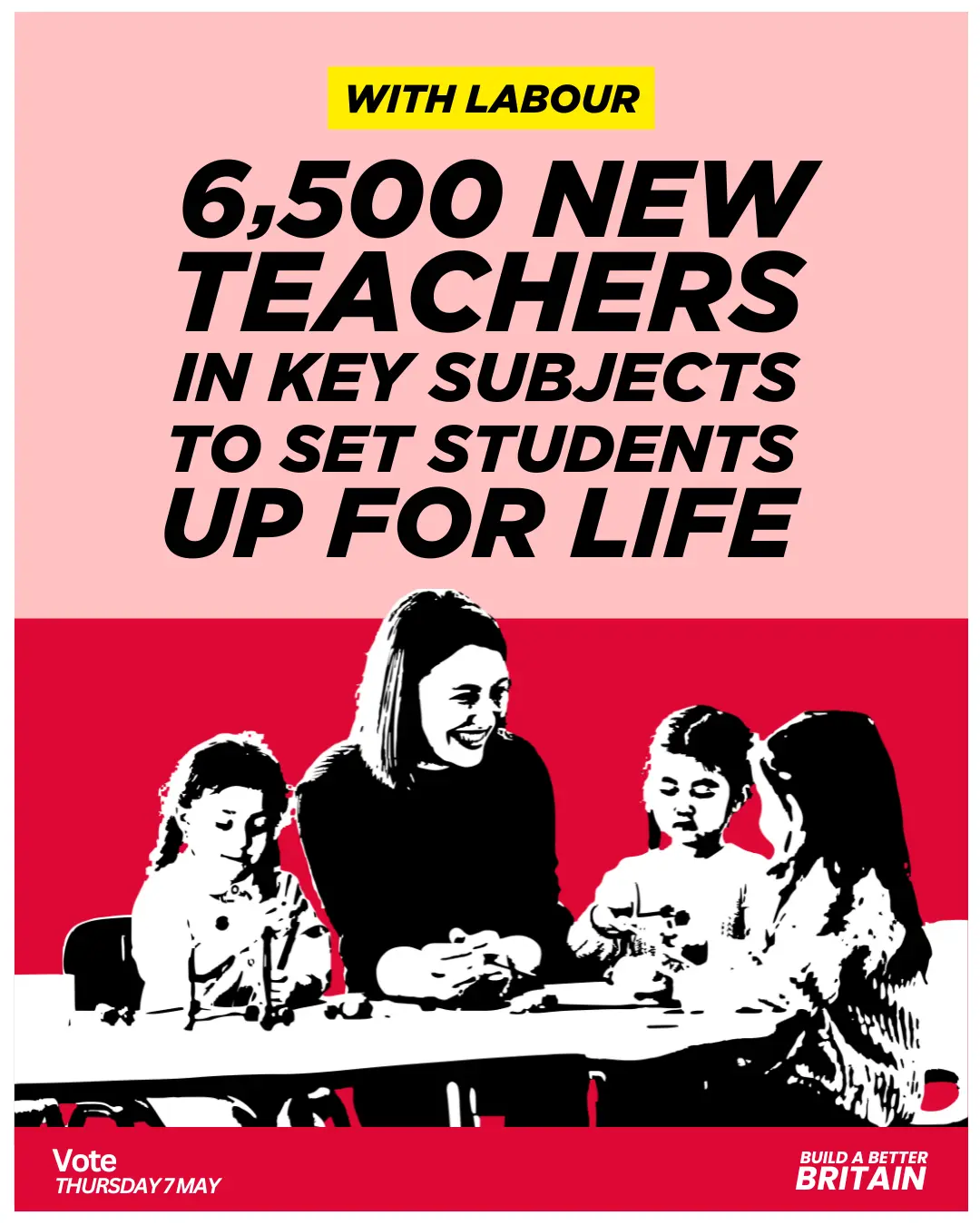
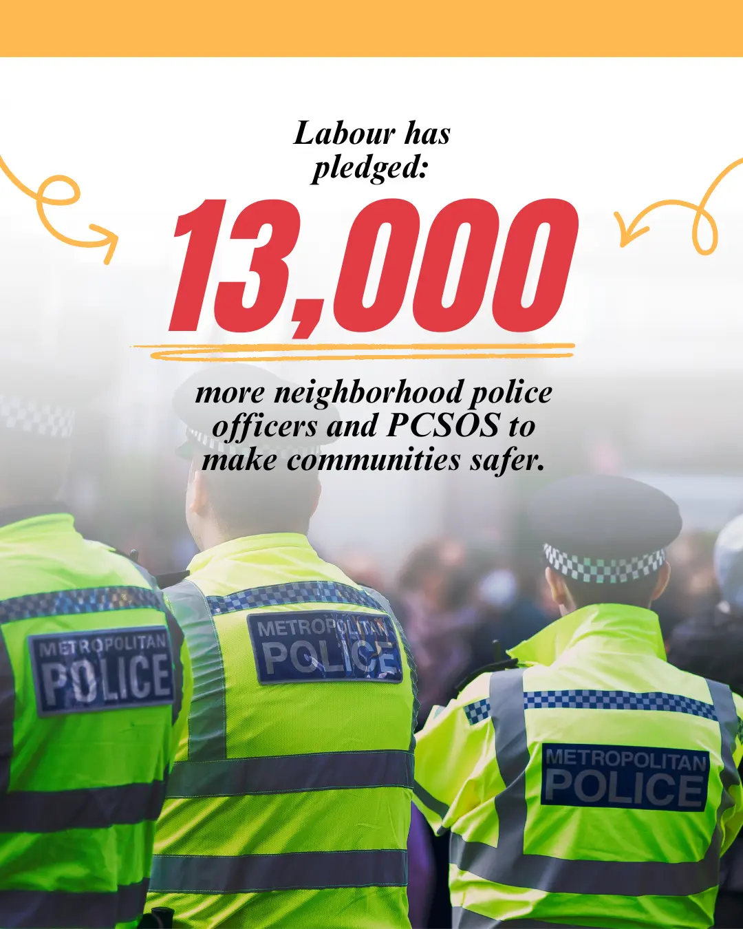
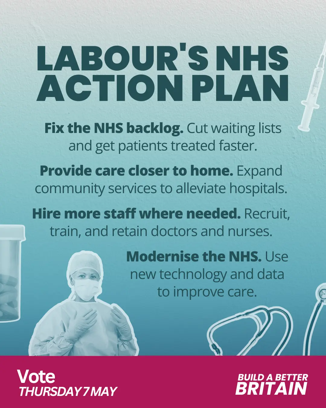
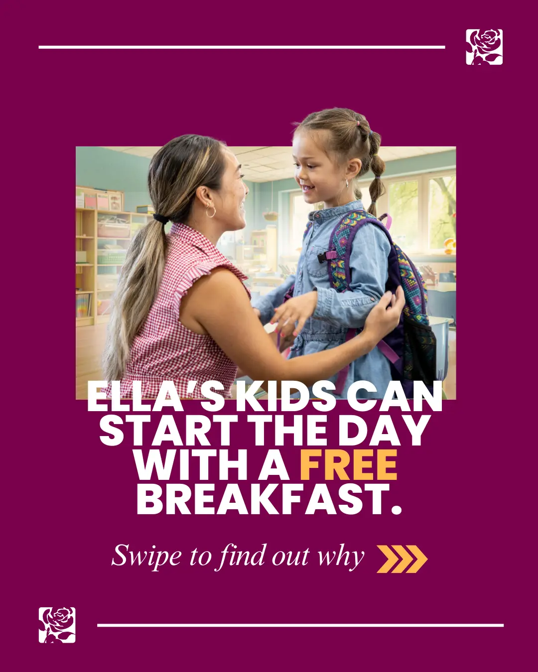
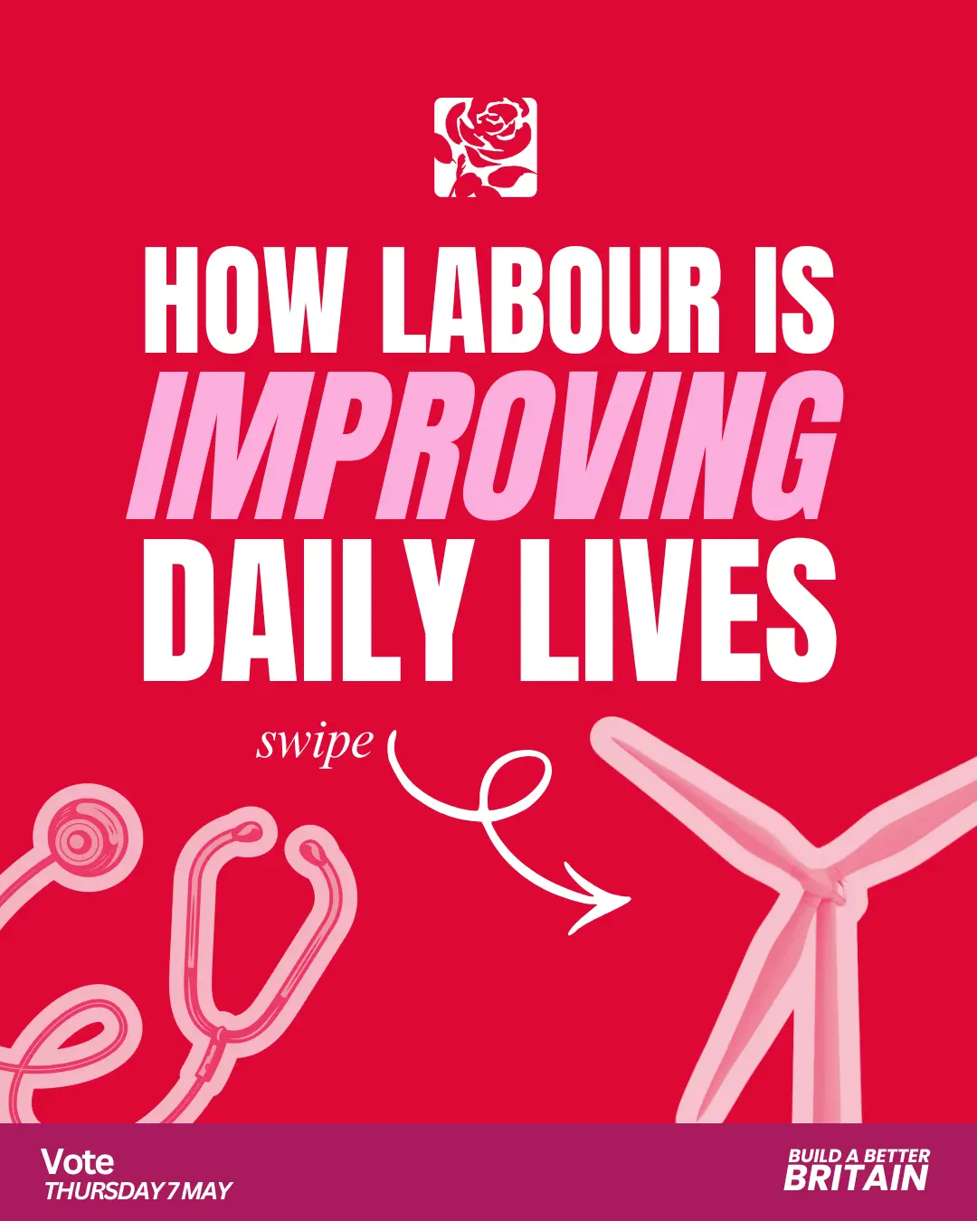
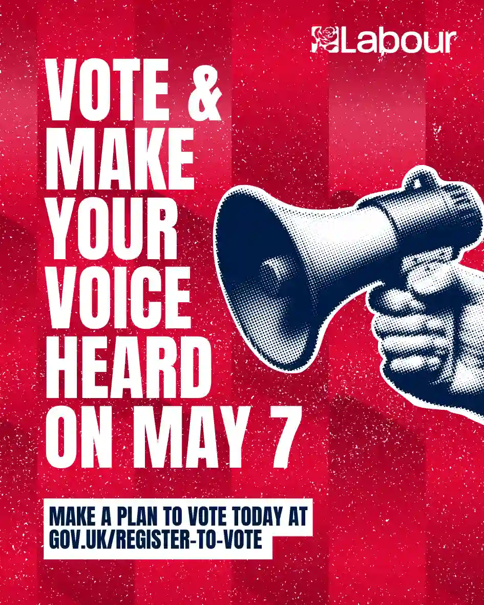
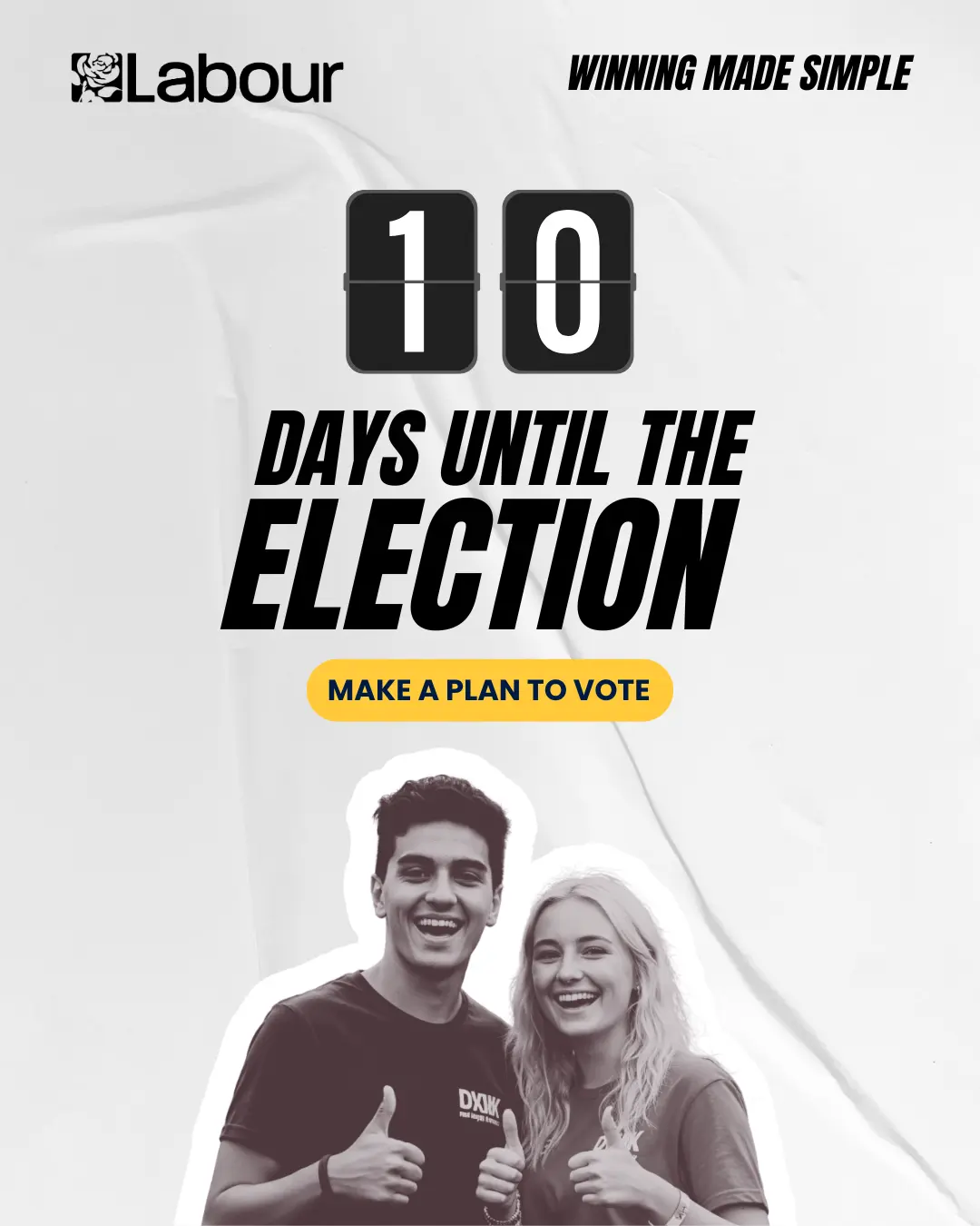
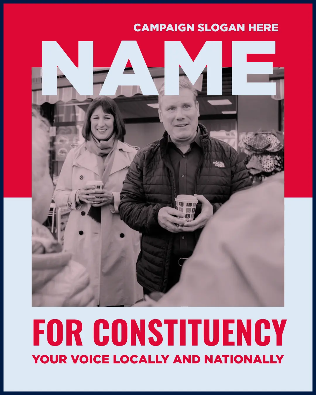
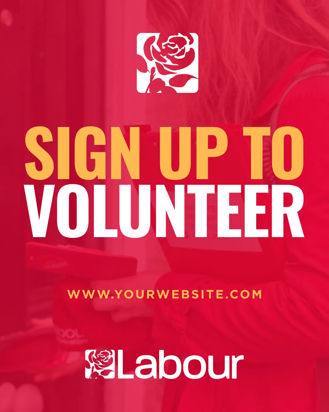
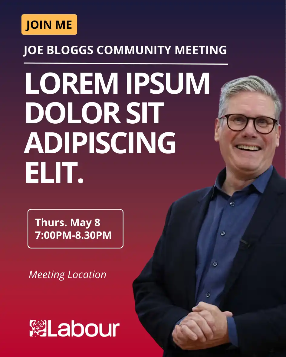
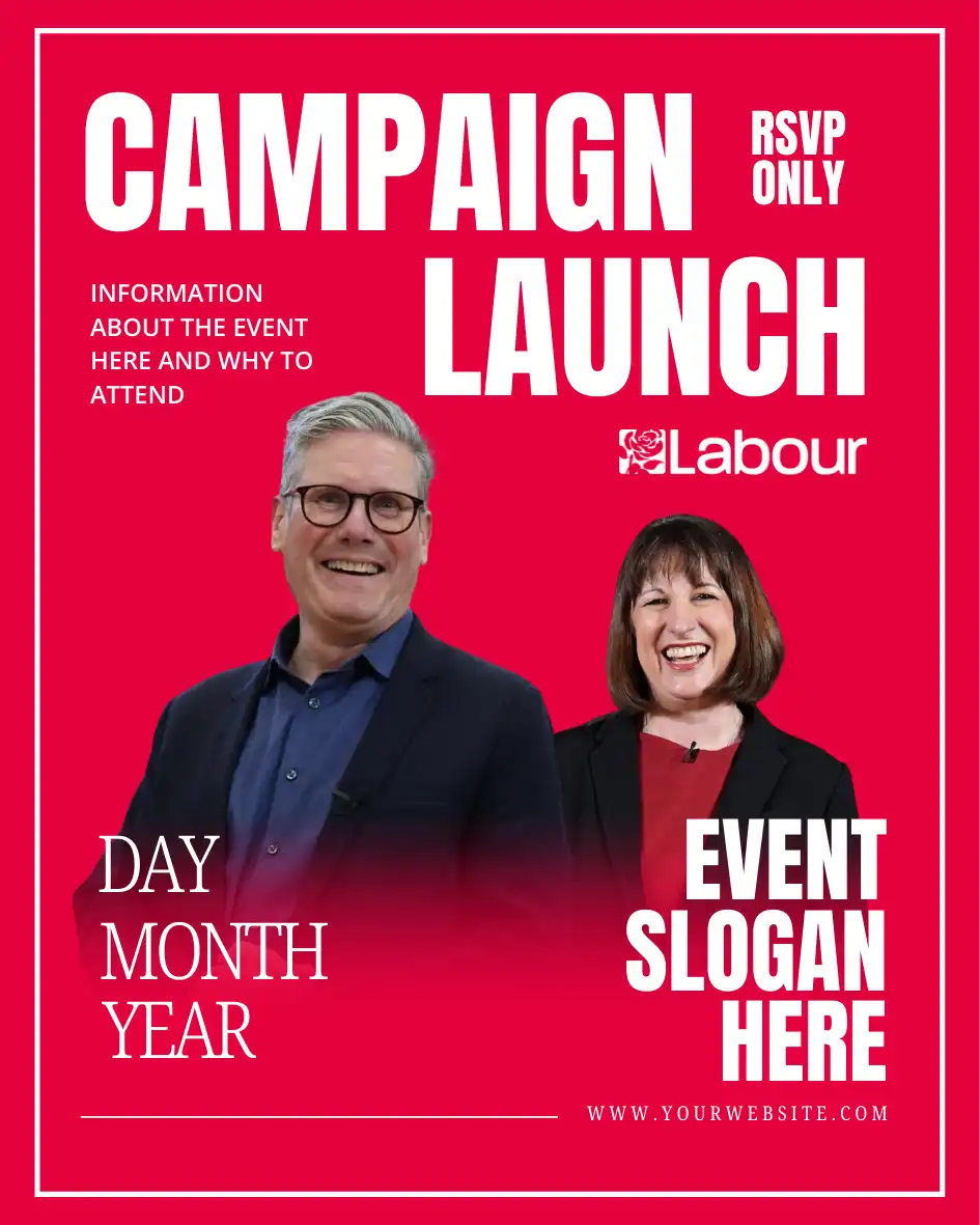
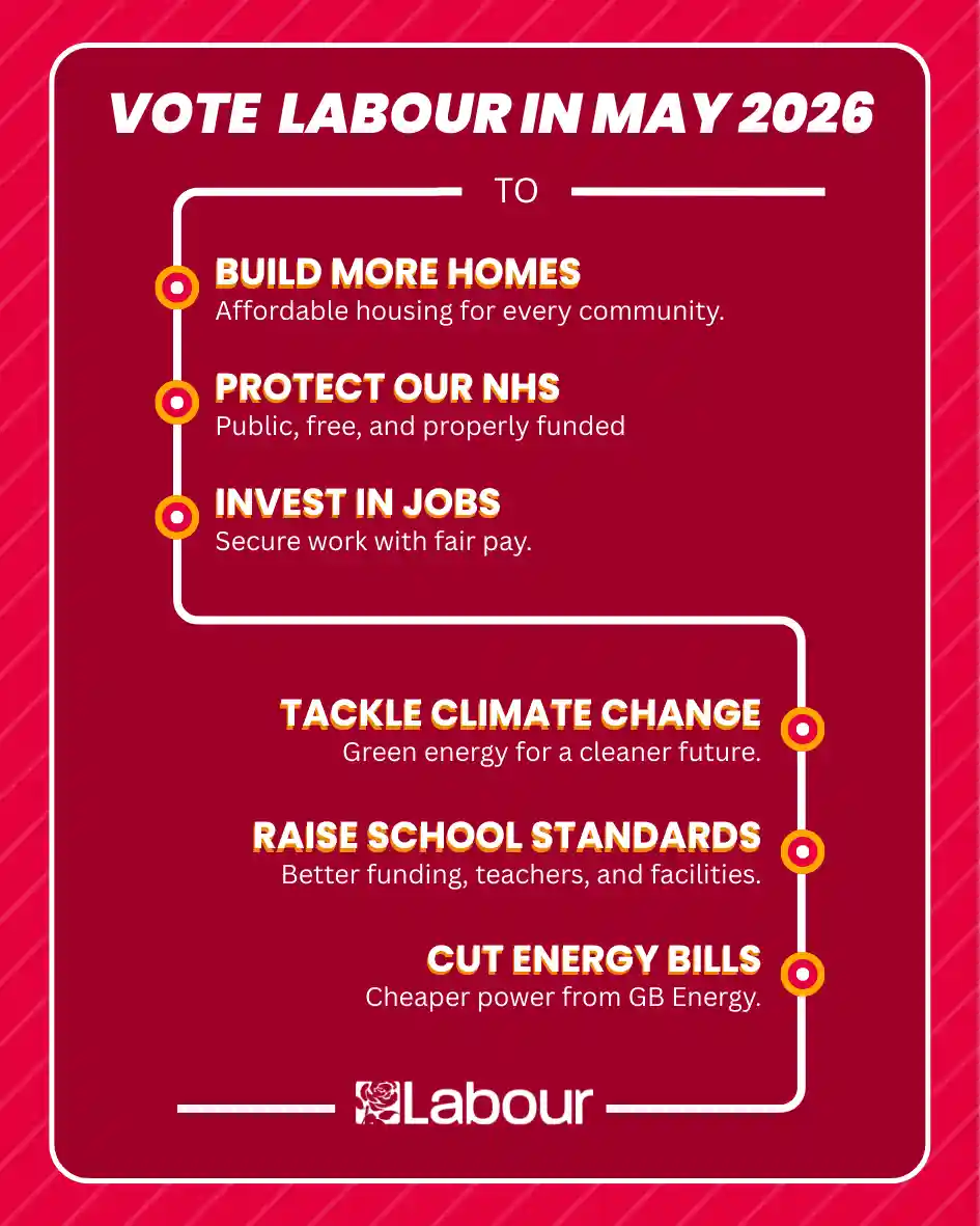
The templates we develop are designed to perform. Strong campaign graphics balance visual clarity with clear, effective messaging. The comparison below shows how small, thoughtful adjustments can help your message stand out while staying true to your campaign’s identity. You bring the priorities and talking points; the design helps make them clear, consistent, and recognisable.
Support for Campaigns
We know time and capacity can be limited during a campaign. Our templates are designed to speed up content creation without compromising on clarity or consistency. For those that want additional support or to fully outsource content creation, we can apply your branding to our graphics, create a full brand kit, design or refine your campaign logo, or develop bespoke graphics tailored specifically to your needs. We’re here to make the process easier so you can focus on reaching voters.
branding, candidates, canva, elections, graphic design, labour party, training
Nitesh Patel has built digital tools for Labour politicians since 2008, supporting councillors, MPs, Welsh MSs and first-time candidates across the UK. He combines technical expertise with grassroots organising experience to create fast, practical campaign websites that help candidates connect with voters and compete effectively.
Kelsey Lewis has worked at the intersection of democracy and design across the UK and internationally, supporting governments and civil society on complex political issues. She brings that experience to Labour campaigns, creating clear, confident brands and campaign assets that help candidates communicate their values and connect with voters.
500+ Graphics Templates
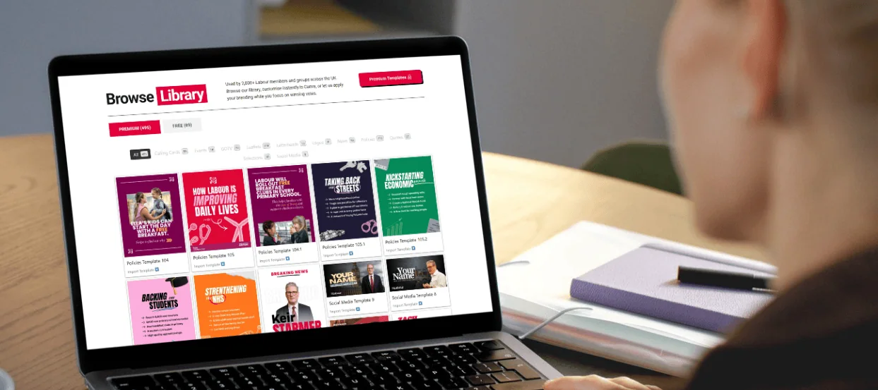
Used by 2,000+ Labour members and groups nationally, get instant access to 500+ graphic templates that convert voters into supporters.
“I can’t recommend Labour Templates enough. The customer service is incredible – they are always available day and night and nothing is ever too much trouble. They offer a full service of digital support and the quality is second to none. I would be lost without them.”
Andrew Ranger MP
Wrexham
“The support from Nitesh Patel (Director) and the team at Labour Templates has been excellent from the outset. They are responsive, offer options and the training videos have been very useful in terms of supporting day to day running of the website.”
Gregor Poynton MP
Livingston
“Would recommend Nitesh Patel (Director), Labour Templates and ePolitixDesign to all candidates and campaigners. The work is all first rate and exactly what you need to run a successful campaign.”
Marc Wickens
Basingstoke Labour
"Their approach is to be as supportive as you need. Nitesh (Director) was always on hand to help for those areas I wasn't able to do myself. The whole process was smooth, and the website looks fantastic. Highly recommended!”
Hersh Thaker
Labour Indians
“Nitesh Patel [Director, Labour Templates] and his team are simply brilliant…For those looking to set up a website for themselves or a group – you will genuinely get everything you need with Labour Templates and much more. High recommended.”
Cllr Lenny Rolles
Weald of Kent Labour
“Labour Templates are absolutely fantastic. They couldn’t have been more helpful in producing a website that looks professional. The response has been brilliant and the ongoing service and advice invaluable. If you are looking for help and support I would stop your search and use Labour Templates.”
Andy Blackaby-Iles
Aylesbury Labour
“Quick, easy, and the website looks a million times better. The customer service from Nitesh Patel [Director, Labour Templates] is on another level to any other service I’ve used and I’m thrilled with the end result and the ongoing support.”
Cllr Chris Cornell
Canterbury Labour
“The team have been at the heart of our success. Their skill, dedication and desire to understand who and what we are has been key to us being able to appear modern, engaging and proactive in sharing our messages. We’ve gone from having three councillors to over 18 and forming an administration.”
Cllr Ciaran Cronnelly
Weston super mare
“The functionality and design of the website is great and the support on offer from Nitesh Patel [Director, Labour Templates] has been invaluable.”
 Pro Tip: Think of your colour palette as a system, not a constraint. There are times when it makes sense to go slightly off-script if it serves the message. For example, using purple on International Women’s Day or green for an Earth Day post. Variance here and there is fine so long as those choices still feel intentional and connected to your overall identity.